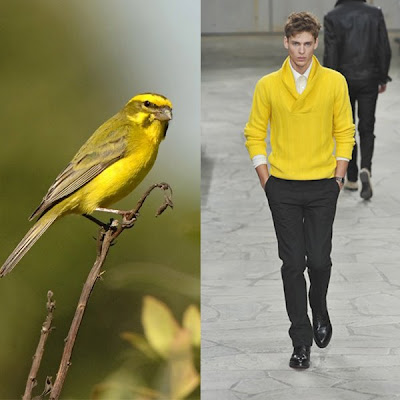
The Fall 2007 trend is back (done best by Etro), but this time unexpectedly pursued by conservative luxury leather goods house Hermes in its Fall 2009 collection.

Sure, this is not the first time it has presented bright and unexpected colors, like blue in Spring 2009 and aqua in Fall 2007, plus some instances of red and non-muted green, but to bring out canary yellow in a significant number of pieces is no different from sending the proverbial yellow bird to test the safety of a mining shaft.
No other designer has produced as much of the color.

Except in few cases, like in this cardigan, canary yellow is done best as a solid color - as in the coat, sweaters, turtleneck, and pants. It attracts attention like a taxi cab. Or these birds.

I previously shied away from the color, as I found it too loud for me to go unnoticed. I thought that, as in the way these outfits have been styled, canary yellow can only go with equally solid black, white, beige, and gray.

But the plumage of these birds show that the color is best rendered with a muddy mix of gradations of these four complements.
I would even go as far as to suggest that technically enhanced combinations be done: like a gray paisley pattern partially printed or embroidered onto canary yellow fabric.

This way, the hue can be subdued and the result can be mixed and matched with more pieces. With gold and/or silver, what do you think?
