There is something uniquely personal about mixing different prints into an outfit, much more so if they have been derived from different cultures. Together, the different fabrics are woven into the personality of their wearer. The combinations of colors, patterns, and textures — even if they seem to clash — cannot help but reflect an interior sensibility.
This, for me, is what makes
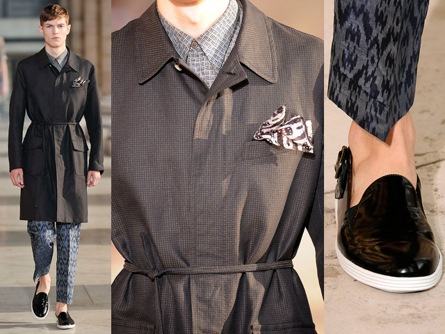
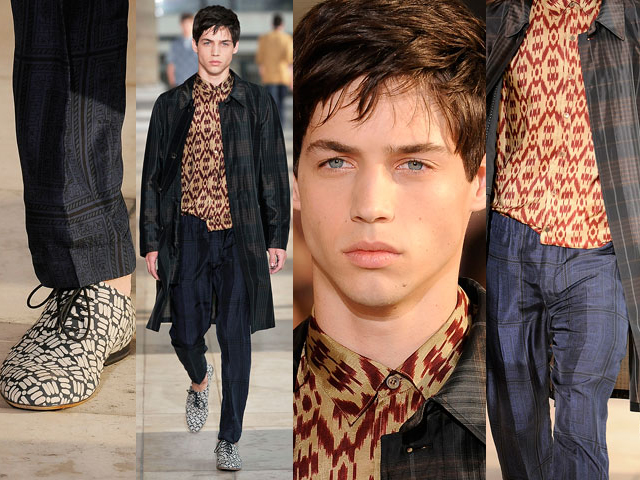
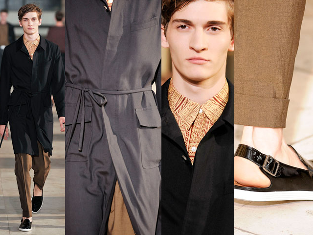
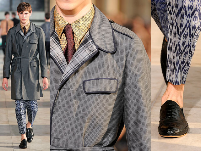
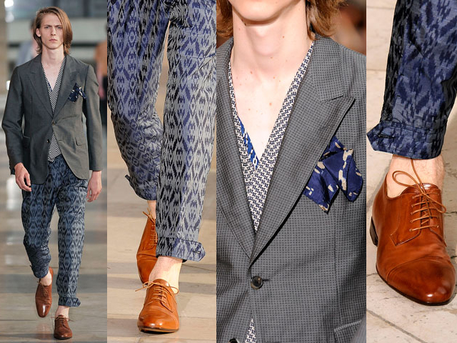
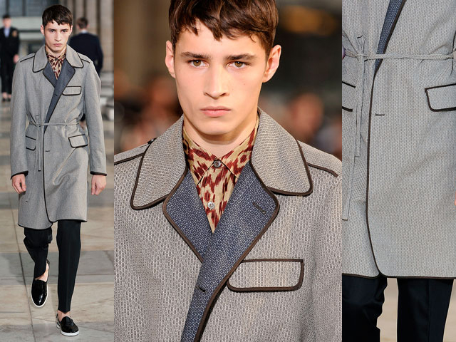
Dries Van Noten's Spring 2010 collection both sensually satisfying and thought provoking. Take for example how the ethnic print on the handmade pocket square above contrasts vividly against the micro check of the coat. Also how the patent, buckled slip-ons meet the blue ikat pants.
Besides the mix of patterns and fabrics, there are quirks and flourishes. Notice that there are no loopholes for the waistband. Everything becomes relaxed and casual. Even with the strong juxtapositions, nothing seems contrived.
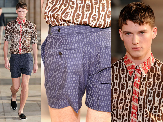
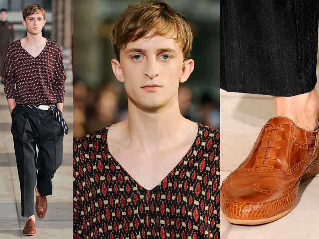
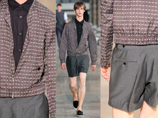
The cultural couplings are not limited between separate items, such as the shirt above in block print and the shorts, in purple batik. The shirt itself is made up of two patterns: block print for the body and what appears to be an embroidered pattern for the collar and placket. Notice that the tailored shorts are, except for the fabric, otherwise western.
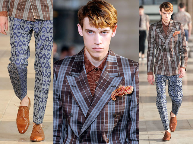
The patterns are generally repeated across different pieces in the collection, matched and rematched with new pieces. This pair of woven laceups looks utterly comfortable, and stands as good halfway ground between the double-breasted jacket and the printed shirt and pants.
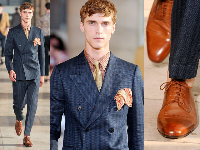
I have always been a fan of blue and brown, no matter how some consider it a faux pas. And I must admit that I have never seen the combination as delicious as this, where Indian ikat is mixed with bold plaid and a micro pattern, and where the orange in the printed pocket square and laceups provide good accents. Of course, the coloring ultimately works because they go with the model's eyes and hair. Everything is where it should be.
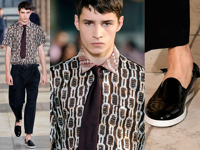
Again, the combination of two patterns in a single shirt, except that only the collar provides a contrast, not the placket. This look is more subdued.
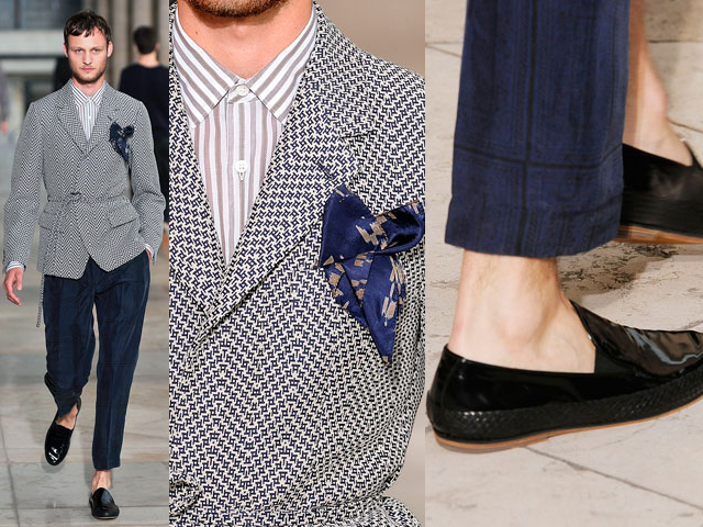
I am not certain of the provenance of this suit's fabric, but up close, the criss-crossing pattern used for the pinstripes looks exotic. No evident browns to go with the blue, but we see here that the color dye of the shoes is uneven, giving the pair a rich, sophisticated sheen.
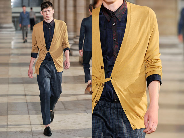
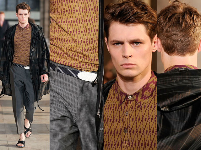
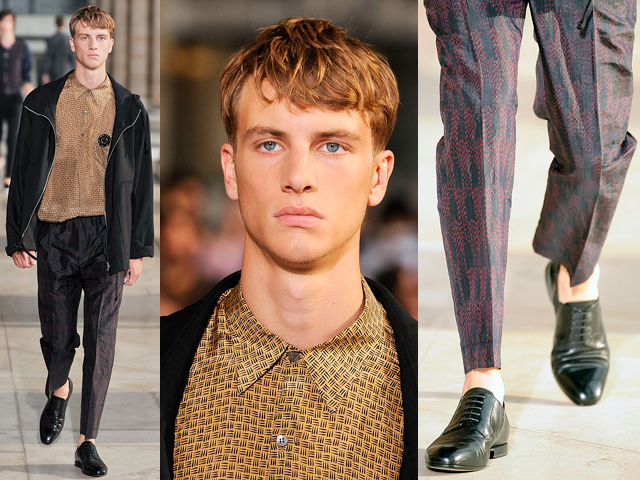
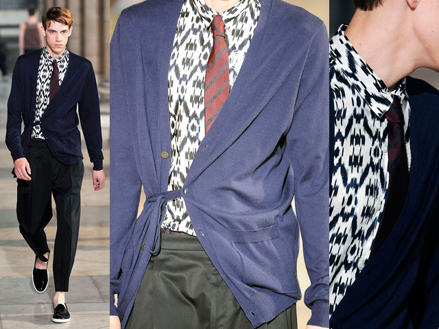
The red pattern on the collar and placket of this geometrically patterned dark blue shirt could almost be missed. I can't help but stare at the detail shot. The unlikely combination of two very different print patterns has produced something so eye-catching. The gartered waist of the pants makes them look almost like pajamas. They are perfectly paired with this mustard cardigan, which can be tied like a robe, even if it already has buttons. I find this detail particularly amazing, especially since the belt extends right from the fabric.
The ikat and plaid combination is now inverted, with the orange pocket square exchanged for something white and blue, to go with the black oxfords.
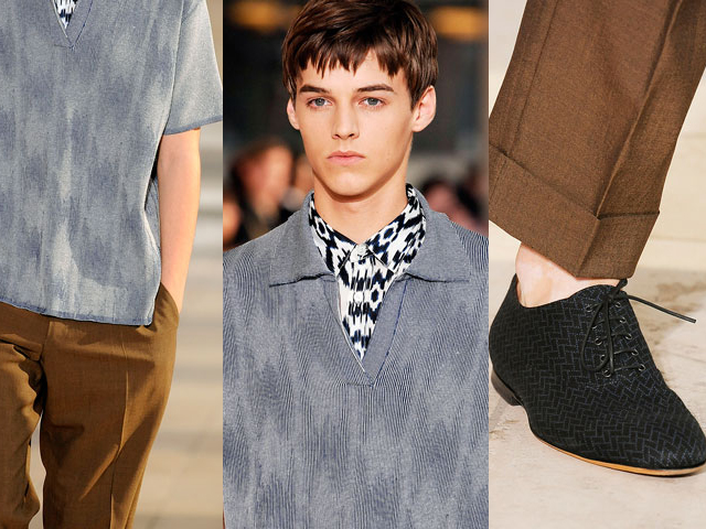
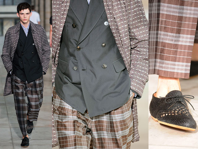
This plaid, almost translucent nylon coat seems to have been simply paired with plaid pants, until one sees the eastern print. This time the ikat pattern appears on the shirt, in tan and red.
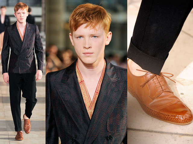
I am not sure whether this enlarged tee is a modification on a piece of traditional dress, but it certainly looks amazing, especially the way the equally large prints on it complement the smaller pattern on the shirt underneath. Then it is blue and brown again, with the trousers that look like stiff linen. The oxfords, meanwhile, introduce the delightful series of patterned shoes in the show.
The patterns, fabrics, and colors are so interchangeable that the print on the previous oxfords now finds itself in a bag with a black leather handle. The mustard in the robe-cum-cardigan has now transferred to these plaid pants, which are tapered and buttoned behind the ankles. The oxfords, for their part, come in a new pattern, which looks more African than Asian.
The enlarged ikat print on a previous tee is once again seen in this beautifully red shirt-jacket, which goes well with the tan silk shirt underneath. Was suprised to find a primary color combination, but it is refreshing to see it in ethnic patterns.
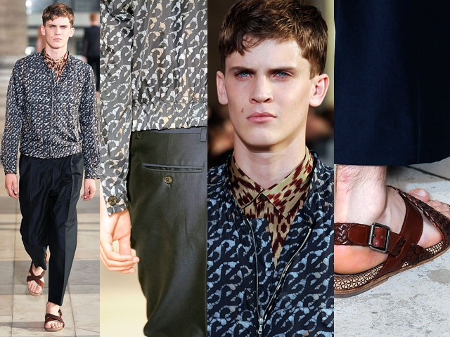
If my little bit of researsh serves me right, the pattern on this next v-neck shirt is African. The tie-belt presented by Dries seasons ago reappears, but this time it is with another hybrid: oxfords with gartered side panels and with a braided base used more for boat shoes and slip-ons.
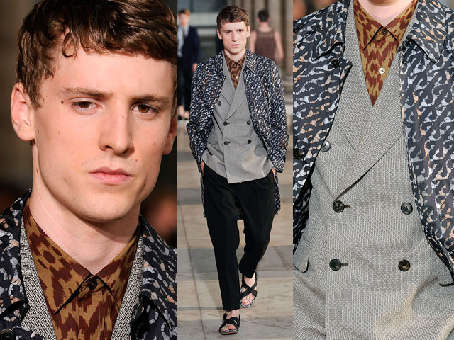
Not to be ignored, the cut of this double-breasted jacket is delightfully slim, hugging the waist while it fluffs a little bit at the bottom of the pockets. If only we can see the vents.
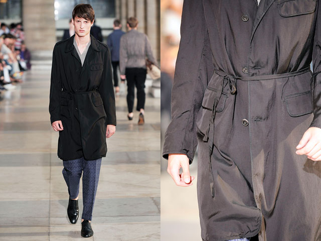
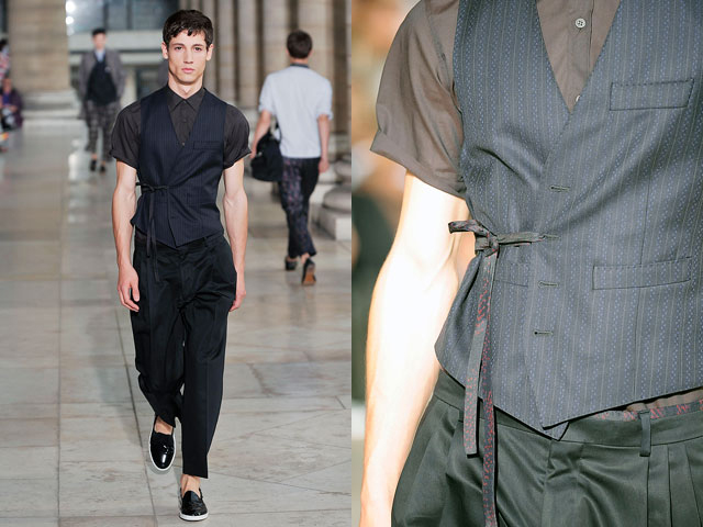
The tie-belt up close, and the nylon coat as a parka.
The red on blue print now appears on a DB.
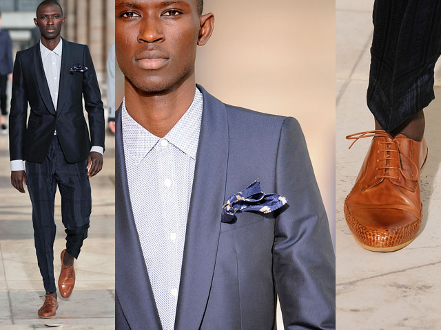
The languorous pocket square is echoed by the deep collar of the similarly blue silky shirt.
Dries has produced this type of patterened jacket before, with gartered waists. This is a pattern update. How can you get enough of those woven sandals?
And again, these derbies that imitate rattan weaving.
This coat doesn't even hide the fact that it got its lineage from both the bathrobe and the pajama. What a brave statement for outerwear, even more daring, I venture to say, than
Dolce & Gabbana's pajama suits.
Is there something wrong with this shirt? Is that a green stain on it, or is it, as Tim Blanks states, the imperfections resulting from handcrafted materials? Whatever it is, it definitely adds charm. Worn with a tie, the printed shirt is a welcome proposition to soften business wear.
Notice how a pattern from one of the derbies above is repeated in this yellow shirt, and how the red on blue print has been enlarged for the tapered pants.
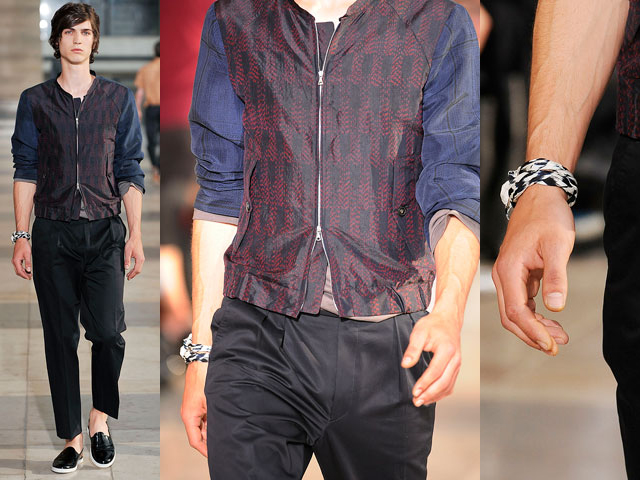
I bet this bracelet used to be a pocket square.
Is that a vest underneath? If so its hems sure look like separate neck ties. And is that a scarf peeking? With a miniature version of the print on the pocket square?
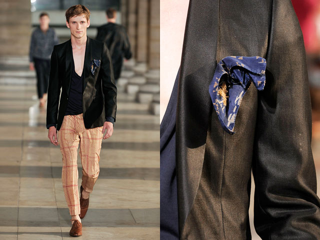
I've seen newspapers used as pocket squares in editorials. Actual text characters on cloth top the effect. I love how this double-breasted jacket is worn totally unbuttoned.
Isn't it wonderful how tuxedo jackets can wander into this collection and not look out of place?
The robe-pajama coat above has been turned into a jacket with narrow piping.
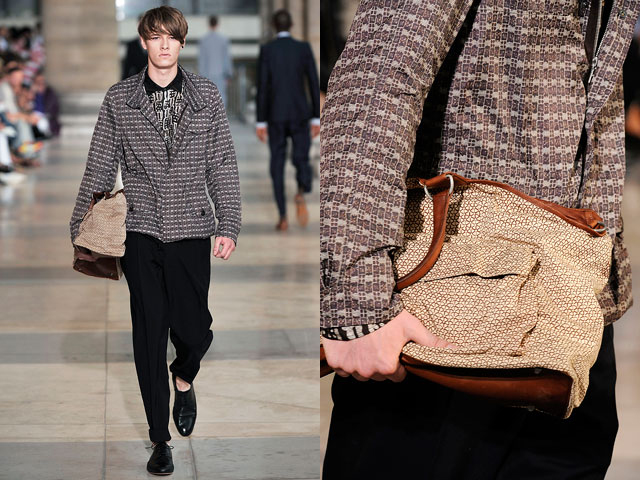
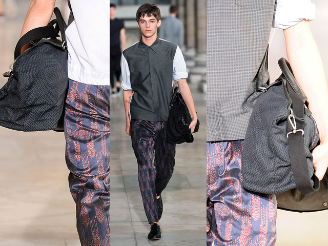
Though the pattern on this jacket is lovely, what I am more interested in is the black and dirty white print underneath. About the bag, I do not even know where to begin. The pattern looks better than the blue one above, and the leather trimmings — not that different from the material of the derbies — go well with the fabric. I also love how it can be held like this, how it can collapse when it is virtually empty.
The pocket squares get even better as the edges become more fringed. The combination of the woven strap, the flat handles, and the otherwise unadorned body of this briefcase, puts this bag among the top in my list. It looks classic, modern, personal, and sophisticated.
The jacket over DB looks interesting. The casual combination actually allows the ensemble to come with sandals.
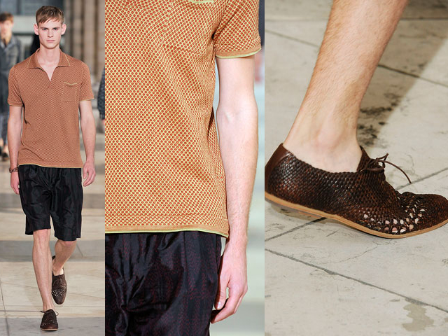
The black version of the woven derbies. Note also that the collar of the shirt doesn't come in simple polka dots.
Here are the spots dominating an entire shirt. Ah, these shoes will always haunt me.
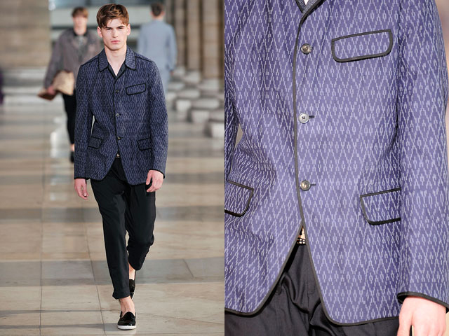
This belted jacket may remind one of the refinement of Yves Saint Laurent, but it is the use of pattern in the pants and the pairing with printed pocket squares and patent slip-ons that make this outfit uniquely Dries. These, and the curved cut.
Three pleats, three colors, two patterns: they work so well together that one would never think of the word "excess".
It is this abandon to the senses that single out this collection, the external expression of personal enjoyment.