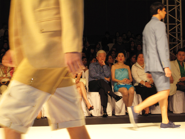
I have just been going through the official PR photos from last week's Manila fashion shows. Although they are keen to show the public exactly what the clothes look like, somehow the romance and feel of the pieces don't show. So for this season, I am glad to say that I am fairly satisfied with how my own photos from the front row turned out.
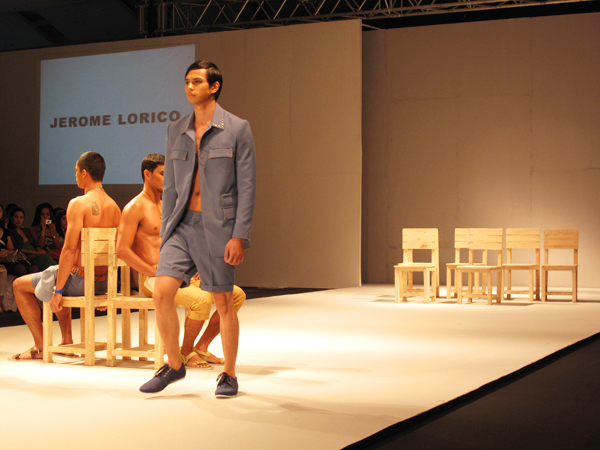
I feel that among the shows, Jerome Lorico's was the most cohesive — in the way that he presented an idea and brought it to its completion. Of course you can say that the simpler the idea is, the easier it is to execute. But as it happens, simplicity is not as simple to achieve.
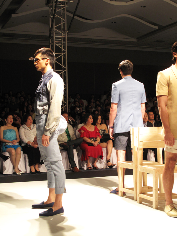
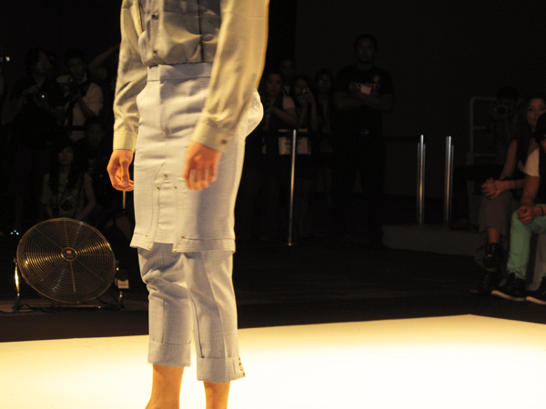
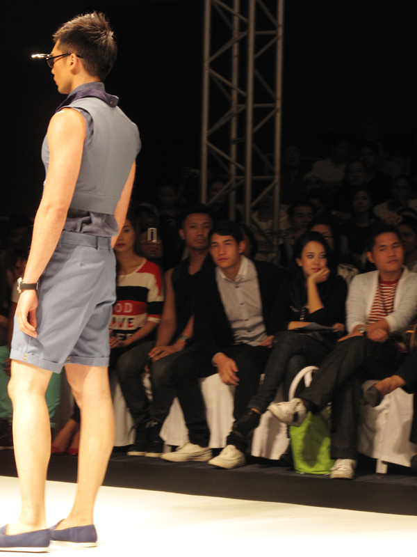
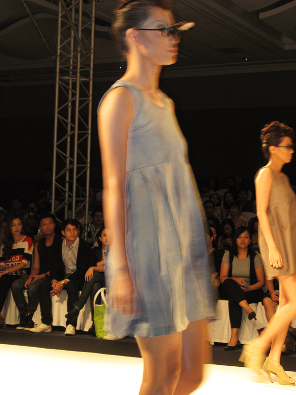
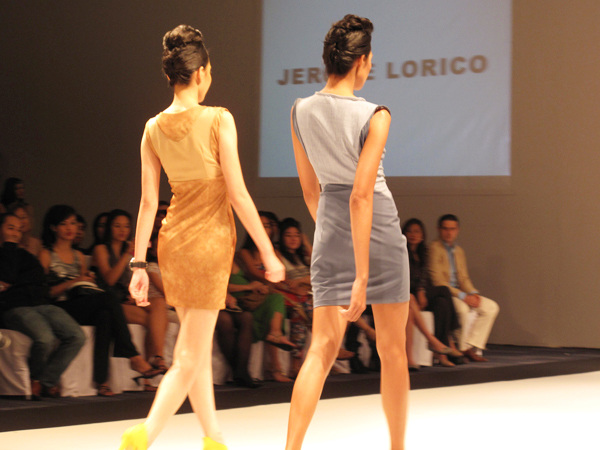
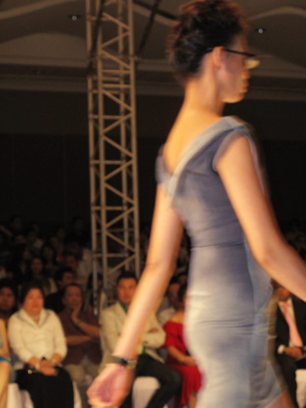
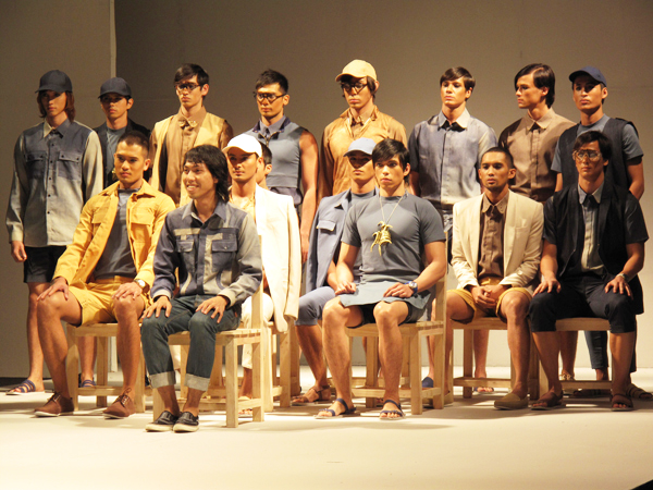
Needless to say, Jerome's entire collection is in varying shades of blue and beige, but it is the treatment of the fabric and the details that raise the twin monochromatic theme.
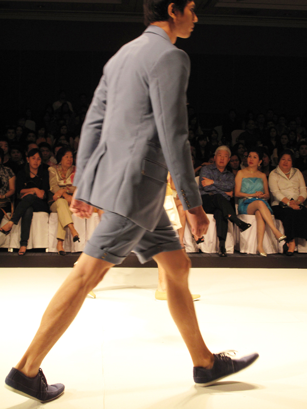
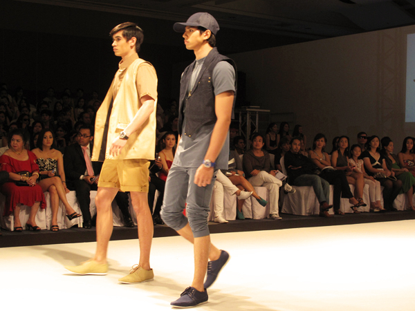
Notice that the shorts-on-pants idea has been modified into a semi-jumper/apron-on-pants concept. The jackets are slim fitted, with a slight shoulder pagoda (Or is this just the result of big arms?).
Rivets are used all around — from collars and hems to sleeves and pocket details.
I like the styling.
I like the linens.
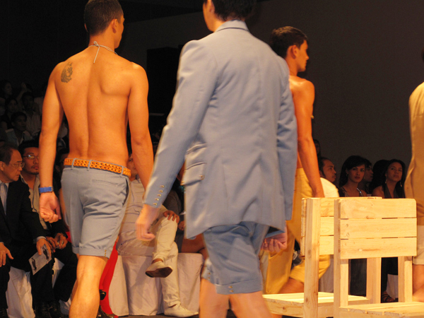
The braided belt is a nice touch.
Though the fit and cut may not survive closer inspection.
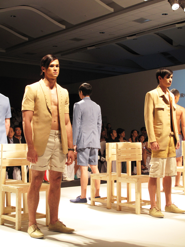
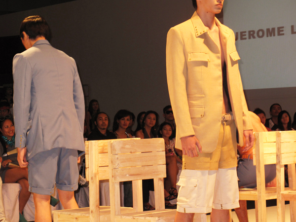
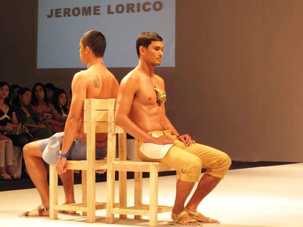
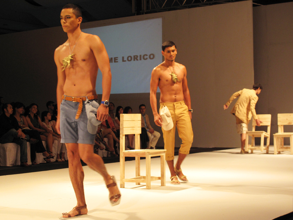
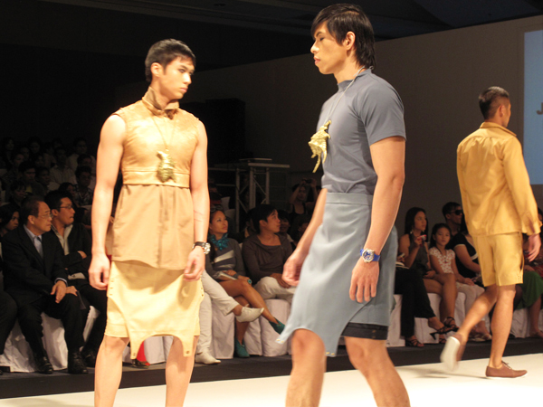
The use of the conch shell as accent is good, as it informs the audience of the range of settings the outfits can be worn in.
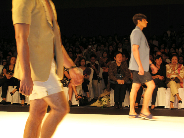
They move well.
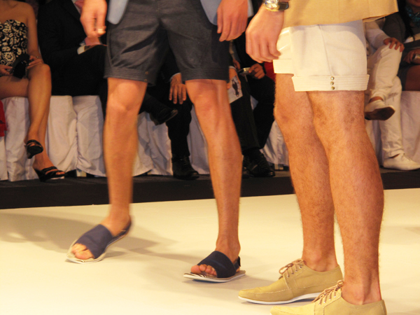
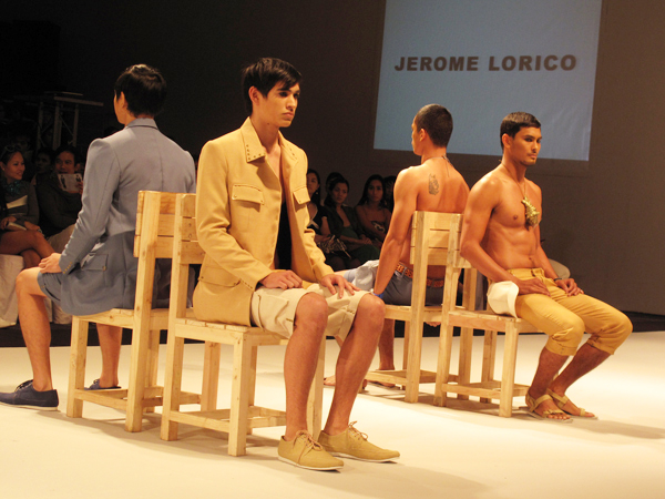
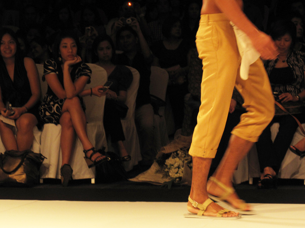
The shoes and sandals are remarkable — designed by Bang Pineda for local shoe label Cardams.
They embody youth and summer, and offer a flexible array.
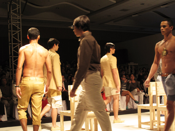
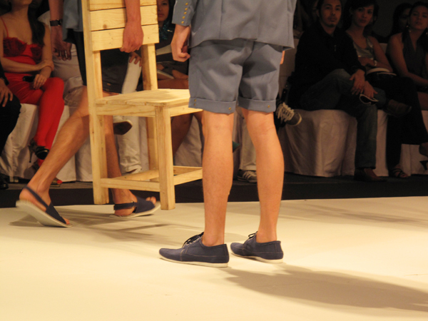
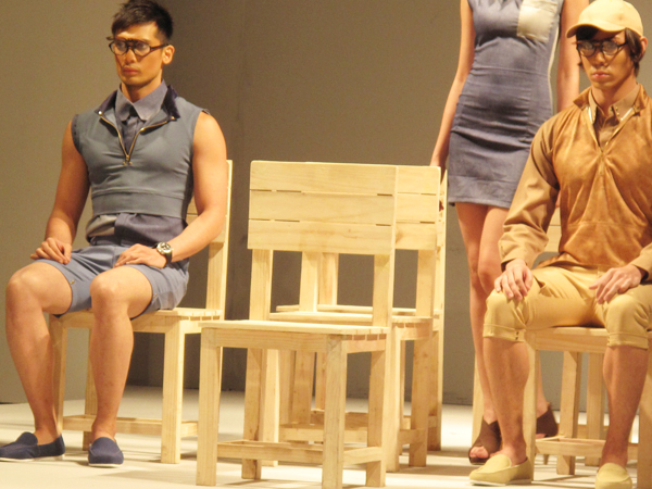
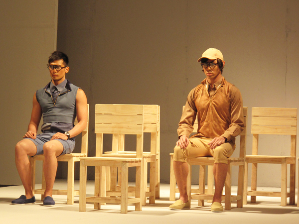
The idea of shifting configurations of wooden chairs also aids the show well — they suggest not just the classroom, but also outdoor locations. The arrangement shifts as one imagines different places.
I honestly think I have a better vantage point than the photographers in front of the runway, who cannot see this.
It is also interesting to document the reaction of the audience.
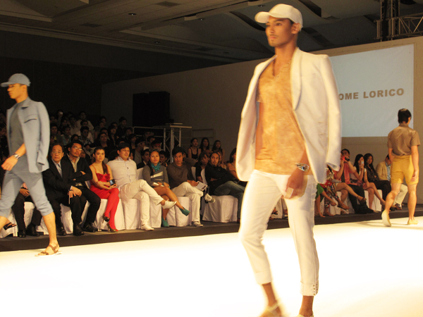
What do you think of the midriff vest? Isn't it a good half-sporty/half-casual alternative? I also like the two-tone, sleeveless shirt — no matter how the pair resembles the sleevless outfits in the latest Prada offering.

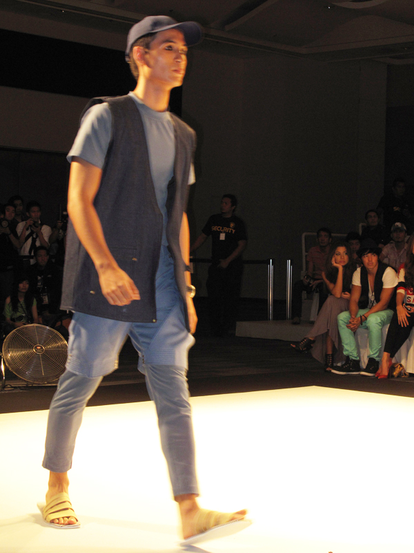
The striped soles of the sandals make them suitable not just for the beach, but also for drawstring pants weekends.
The bunching up of shirts is apparently everybody's problem.
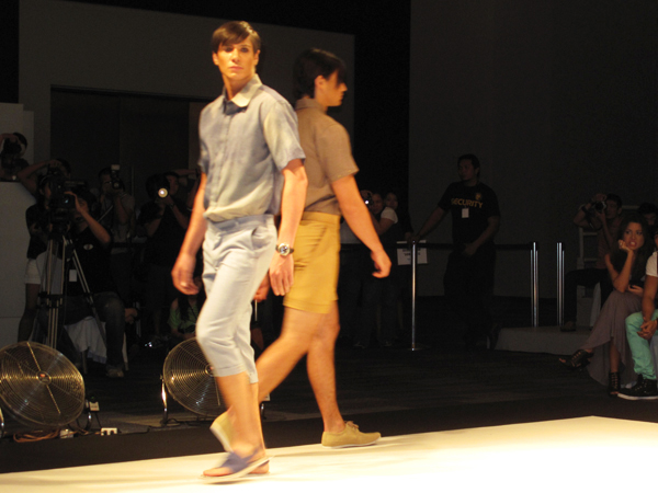
The blue linen shirt is dyed to resemble denim. Isn't that wonderful?
Though I can't say the same for the tan version. But nevermind, the shawl collared jacket more than makes up for it.
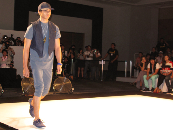
The cut of this vest makes me look at it twice, but it seems as if there's something wrong with this outfit's proportions.
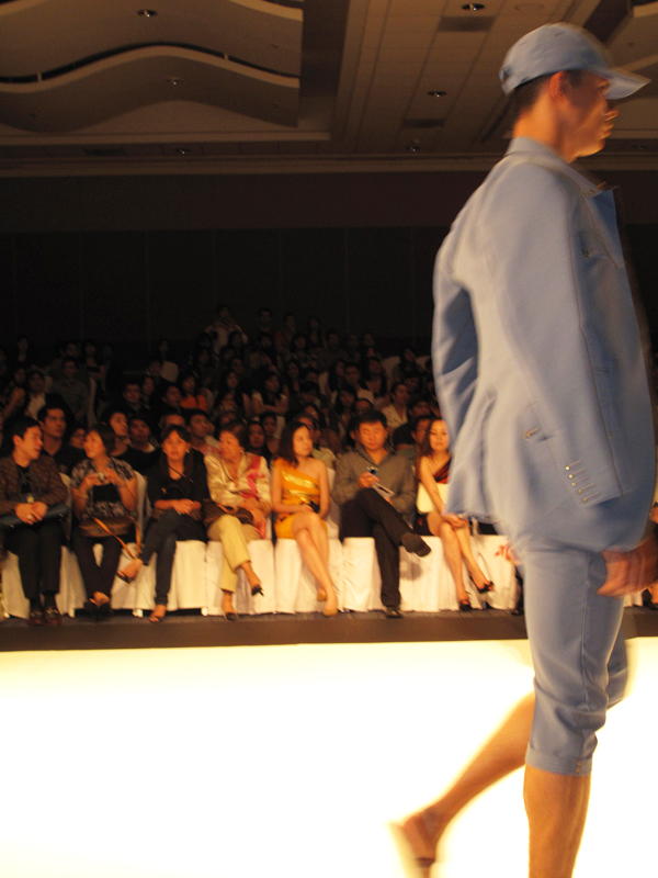
The exact hue of blue is riveting.
Again, the proportions — the hem of the long vest is too near to the hem of the shorts. Though I appreciate the partnering of yellow and blue.
No shorts this time. Time for lunch!
Lorico is better with menswear, but his "denim" pieces for women are not at all bad.
The shoulders have it.
Dyeing that simulates powder.
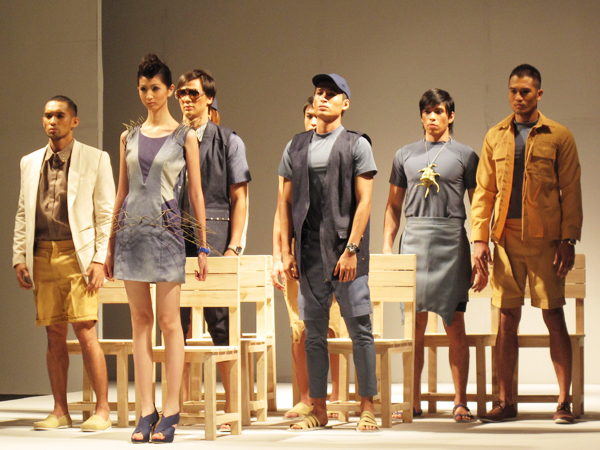
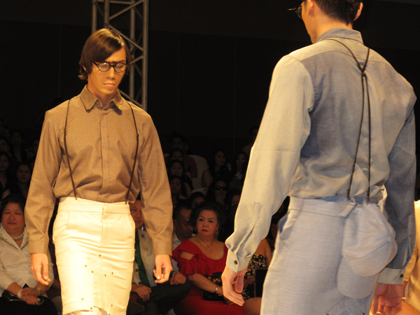
The class is now ended. Please stand up,students.
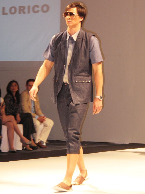
Take off your shades, young boy. Let me tell you that at least for this ensemble, the lengths of the vest and pants are perfectly coordinated. Nice sandals too.
Of course, the designer gets to wear the best shirt in his collection, though the leftmost guy doth protest.